Setting Types
Bagisto Visual includes a range of setting types like text inputs, color pickers, toggle switches, dropdowns, and more. These ready-made types make it easy for developers to offer flexible customization options in sections, blocks, and themes — all through the visual editor.
Standard Setting Attributes
Every setting type supports a few standard attributes:
| Attribute | Description | Required |
|---|---|---|
id | The unique identifier for the setting. | Yes |
label | The text label shown to merchants. | Yes |
default | The default value assigned to the field. | No |
info | Optional helper text shown below the field. | No |
Available Setting Types
Text
Single-line text input. Useful for headings, labels, and short descriptions.
In addition to the standard attributes, Text type settings have the following attribute:
| Attribute | Description | Required |
|---|---|---|
placeholder | A placeholder value for the input. | No |
use BagistoPlus\Visual\Settings\Text;

public static function settings(): array
{
    return [
        Text::make('title', 'Heading')
            ->default('Welcome to our store')
            ->placeholder('Enter heading here...'),
    ];
}
In Blade:
@if ($section->settings->text)
    <h1>{{ $section->settings->text }}</h1>
@endif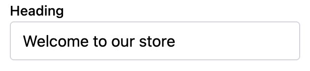
Textarea
Multiline text input. Useful for longer descriptions or rich content areas.
In addition to the standard attributes, Textarea type settings have the following attribute:
| Attribute | Description | Required |
|---|---|---|
placeholder | A placeholder value for the textarea. | No |
use BagistoPlus\Visual\Settings\Textarea;

public static function settings(): array
{
    return [
        Textarea::make('description', 'Store Description')
            ->default('This is your store description.')
            ->placeholder('Write something about your store...'),
    ];
}
In Blade:
@if ($section->settings->description)
    <p>{{ $section->settings->description }}</p>
@endif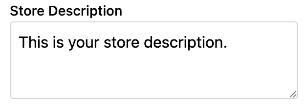
Checkbox
Simple true/false toggle. Useful for enabling or disabling features.
Checkbox settings do not have any additional attributes beyond the standard attributes, but support an alternative switch variant for a different visual style.
use BagistoPlus\Visual\Settings\Checkbox;

public static function settings(): array
{
    return [
        Checkbox::make('show_banner', 'Show Banner')
            ->default(true),
    ];
}
Switch Variant
Use the asSwitch() method to display the checkbox as a toggle switch instead of a standard checkbox:
Checkbox::make('enable_feature', 'Enable Feature')
    ->asSwitch()
    ->default(false),
In Blade:
@if ($section->settings->show_banner)
    <div class="banner">
        <!-- Banner content here -->
    </div>
@endif
INFO
If default is unspecified, it defaults to false.
Radio
Single option selection via radio buttons. Useful for choosing between predefined mutually exclusive options.
In addition to the standard attributes, Radio type settings have the following attribute:
| Attribute | Description | Required |
|---|---|---|
options | Array of options formatted as 'value' => 'Label' or [ 'value' => ..., 'label' => ... ] | Yes |
use BagistoPlus\Visual\Settings\Radio;

public static function settings(): array
{
    return [
        Radio::make('alignment', 'Alignment')
            ->options([
                'left' => 'Left',
                'center' => 'Center',
                'right' => 'Right',
            ])
            ->default('center'),
    ];
}
Alternative format:
Radio::make('alignment', 'Alignment')
    ->options([
        ['value' => 'left', 'label' => 'Left'],
        ['value' => 'center', 'label' => 'Center'],
        ['value' => 'right', 'label' => 'Right'],
    ])
    ->default('center');
In Blade:
<div class="text-{{ $section->settings->alignment }}">
    <!-- Content -->
</div>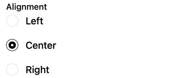
INFO
If default is unspecified, then the first option is selected by default.
Select
Dropdown selection. Useful for choosing from a list of predefined options.
In addition to the standard attributes, Select type settings have the following attribute:
| Attribute | Description | Required |
|---|---|---|
options | Array of options formatted as 'value' => 'Label' or [ 'value' => ..., 'label' => ... ] | Yes |
use BagistoPlus\Visual\Settings\Select;

public static function settings(): array
{
    return [
        Select::make('layout', 'Layout Style')
            ->options([
                'grid' => 'Grid',
                'list' => 'List',
            ])
            ->default('grid'),
    ];
}
Alternative format:
Select::make('layout', 'Layout Style')
    ->options([
        ['value' => 'grid', 'label' => 'Grid'],
        ['value' => 'list', 'label' => 'List'],
    ])
    ->default('grid');
In Blade:
<div class="layout-{{ $section->settings->layout }}">
    <!-- Content displayed based on layout type -->
</div>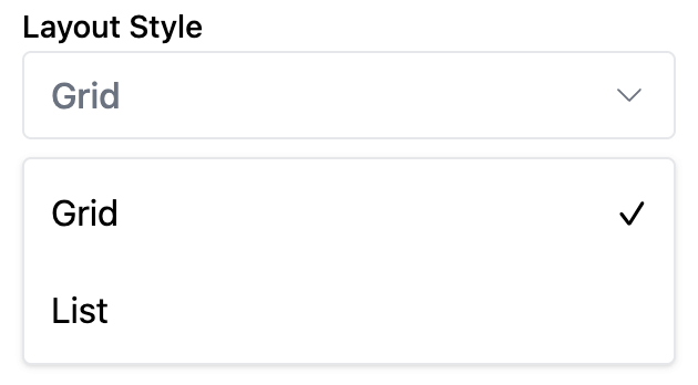
INFO
If default is unspecified, then the first option is selected by default.
Range
Numeric slider input. Useful for values like spacing, number of columns, or padding.
In addition to the standard attributes, Range type settings have the following attributes:
| Attribute | Description | Required |
|---|---|---|
min | Minimum value allowed | Yes |
max | Maximum value allowed | Yes |
step | Increment steps (default 1) | No |
unit | Optional label for unit display | No |
use BagistoPlus\Visual\Settings\Range;

public static function settings(): array
{
    return [
        Range::make('columns', 'Number of Columns')
            ->min(1)
            ->max(6)
            ->step(1)
            ->unit('cols')
            ->default(3),
    ];
}
In Blade:
<div class="grid-cols-{{ $section->settings->columns }}">
    <!-- Grid content with dynamic columns -->
</div>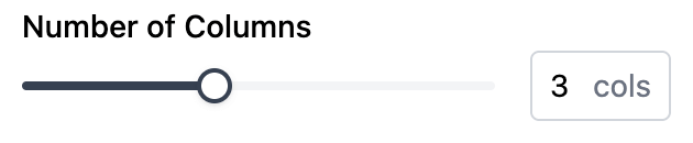
INFO
If default is unspecified, it defaults to the minimum value.
Number
Single-line numeric input. Useful for entering quantities, prices, padding, margins, and other number-based configurations.
In addition to the standard attributes, Number type settings have the following attributes:
| Attribute | Description | Required |
|---|---|---|
placeholder | A placeholder value for the input. | No |
min | Minimum value allowed | No |
max | Maximum value allowed | No |
step | Increment steps (default 1) | No |
use BagistoPlus\Visual\Settings\Number;

public static function settings(): array
{
    return [
        Number::make('max_width', 'Max Width')
            ->min(320)
            ->max(1920)
            ->step(10)
            ->default(1200)
            ->placeholder('Enter a maximum width...'),
    ];
}
In Blade:
<div style="max-width: {{ $section->settings->max_width }}px;">
    <!-- Content -->
</div>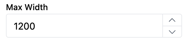
Spacing
Four-sided spacing input. Useful for controlling padding and margin values independently for each side (top, right, bottom, left).
The visual editor provides an intuitive interface with four individual number inputs and a link toggle button that allows merchants to sync all sides to the same value when enabled.
In addition to the standard attributes, Spacing type settings have the following attributes:
| Attribute | Description | Required |
|---|---|---|
min | Minimum value for each side | No |
max | Maximum value for each side | No |
use BagistoPlus\Visual\Settings\Spacing;

public static function settings(): array
{
    return [
        Spacing::make('padding', 'Padding')
            ->min(0)
            ->max(100)
            ->default(['top' => 16, 'right' => 16, 'bottom' => 16, 'left' => 16]),

        Spacing::make('margin', 'Margin')
            ->min(-50)
            ->max(100),
    ];
}
In Blade:
<div style="padding: {{ $section->settings->padding->top }}px
                      {{ $section->settings->padding->right }}px
                      {{ $section->settings->padding->bottom }}px
                      {{ $section->settings->padding->left }}px;">
    <!-- Content -->
</div>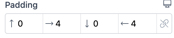
INFO
- Default values: All sides default to
0if not specified - The visual editor includes a link toggle to sync all sides
- Negative values are supported for margins (set appropriate min value)
Color
Color picker input. Useful for background colors, text colors, or brand-related customization.
When accessing a color setting inside Blade, the value is either:
null(if no color selected)- an instance of
matthieumastadenis\couleur\Color
use BagistoPlus\Visual\Settings\Color;

public static function settings(): array
{
    return [
        Color::make('background_color', 'Background Color')
            ->default('#92400e'),
    ];
}
In Blade:
@if ($section->settings->background_color)
    <div style="background-color: {{ $section->settings->background_color }};">
        <!-- Content -->
    </div>
@endif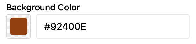
Gradient
Gradient picker input. Useful for hero backgrounds, banner overlays, cards, and other surfaces that need a configurable CSS gradient.
use BagistoPlus\Visual\Settings\Gradient;

public static function settings(): array
{
    return [
        Gradient::make('background_gradient', 'Background Gradient')
            ->default('linear-gradient(90deg, #000000ff 0%, #ffffffff 100%)'),
    ];
}
In Blade:
@if ($section->settings->background_gradient)
    <div style="background-image: {{ $section->settings->background_gradient }};">
        <!-- Content -->
    </div>
@endif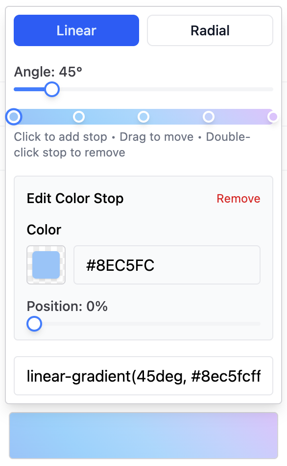
Supported Formats
The visual picker supports one non-repeating CSS gradient:
linear-gradient(...)radial-gradient(circle, ...)
Linear gradients support degree angles and simple direction syntax such as to right, to top, to bottom, to left, and clean diagonal directions like to top right.
Radial gradients support circle only. Ellipse gradients, size keywords, and positioned radial gradients are not supported by the visual picker.
Color stops can use concrete colors accepted by the editor color picker, including:
- Hex colors, including alpha hex
rgb(...)andrgba(...)hsl(...)andhsla(...)- Standard named colors
Stop positions support percentages. Omitted stop positions are normalized using CSS interpolation behavior.
Unsupported values include:
var(...)currentColorcolor-mix(...)- unresolved or advanced CSS color functions
- color hints
- multi-position stops
- non-percentage stop positions
INFO
Theme defaults should use the supported subset when the value needs to remain editable in the visual picker.
Link
URL input field. Useful for buttons, banners, images, and any elements that need a hyperlink.
The Link setting allows the merchant to either:
- Enter a custom URL manually
- Select a resource (like a Product, Category, or CMS Page) directly from the store
use BagistoPlus\Visual\Settings\Link;

public static function settings(): array
{
    return [
        Link::make('cta_link', 'Call to Action Link')
            ->default('/'),
    ];
}
In Blade:
@if ($section->settings->cta_link)
    <a href="{{ $section->settings->cta_link }}">
        Browse Collection
    </a>
@endif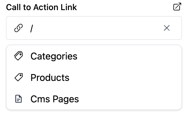
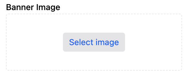
Image
Image picker input. Useful for banners, logos, thumbnails, or any visual element.
The merchant can:
- Upload a new image
- Pick an existing image from the media library
- Define image metadata such as alt text and focal point
use BagistoPlus\Visual\Settings\Image;

public static function settings(): array
{
    return [
        Image::make('banner_image', 'Banner Image'),
    ];
}
In Blade:
@if ($section->settings->banner_image)
    <img
        src="{{ $section->settings->banner_image }}"
        alt="{{ $section->settings->banner_image->alt }}"
        style="object-position: {{ $section->settings->banner_image->objectPosition() }}"
    />
@endif
Image settings are stored as image paths in older themes and as structured values when metadata is edited in the Visual Editor. Both formats are supported. The image value still casts to the image URL, so existing Blade src usage continues to work.
For new sections, prefer the image metadata alt value over creating a separate alt text setting. Existing sections that already use a separate alt setting can keep doing so and migrate gradually.
Video
Video input. Useful for hero videos, product demos, banners, and other media-rich sections.
By default, video settings allow uploaded videos only:
use BagistoPlus\Visual\Settings\Video;

public static function settings(): array
{
    return [
        Video::make('hero_video', 'Hero Video'),
    ];
}
To also allow external YouTube and Vimeo URLs:
Video::make('hero_video', 'Hero Video')
    ->acceptsExternal();
You can restrict or extend the accepted external sources. Custom sources use PHP regex patterns and must point to directly playable video URLs:
Video::make('hero_video', 'Hero Video')
    ->acceptsExternal([
        'youtube',
        [
            'host' => 'cdn',
            'label' => 'CDN video',
            'pattern' => '#^https://cdn\.example\.com/.+\.(mp4|webm|ogg)(\?.*)?$#i',
        ],
    ]);
In Blade:
@if ($section->settings->hero_video)
    {!! $section->settings->hero_video->render(['class' => 'w-full']) !!}
@endif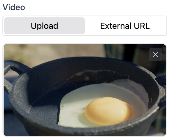
When accessing a video setting inside Blade, the value is a VideoValue object or null. It casts to the renderable video URL and exposes media information:
{{ $section->settings->hero_video->media_type }}
{{ $section->settings->hero_video->host }}
{{ $section->settings->hero_video->url }}
{{ $section->settings->hero_video->original_url }}
Native uploaded videos expose a sources array with URL and MIME type. YouTube videos expose a preview_image value when a thumbnail can be derived.
Video settings support string defaults for uploaded paths, YouTube/Vimeo URLs, and direct web-playable video URLs.
Category
Dropdown selector input. Useful for allowing the merchant to select a category from the store catalog.
When accessing a category setting inside Blade, the value is either:
null(if no category selected)- an instance of the
Webkul\Category\Models\Categorymodel
use BagistoPlus\Visual\Settings\Category;

public static function settings(): array
{
    return [
        Category::make('featured_category', 'Featured Category'),
    ];
}
In Blade:
@if ($section->settings->featured_category)
    <x-shop::category-card :category="$section->settings->featured_category" />
@endif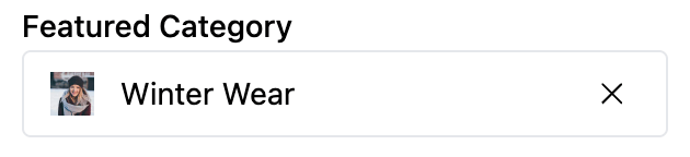
Product
Dropdown selector input. Useful for allowing the merchant to select a product from the store catalog.
When accessing a product setting inside Blade, the value is either:
null(if no product selected)- an instance of the
Webkul\Product\Models\Productmodel
use BagistoPlus\Visual\Settings\Product;

public static function settings(): array
{
    return [
        Product::make('featured_product', 'Featured Product'),
    ];
}
In Blade:
@if ($section->settings->featured_product)
    <x-shop::product-card :product="$section->settings->featured_product" />
@endif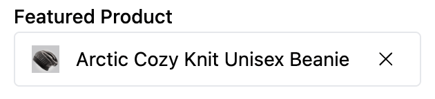
CmsPage
Dropdown selector input. Useful for allowing the merchant to select a CMS page from the store.
When accessing a CMS page setting inside Blade, the value is either:
null(if no page selected)- an instance of the
Webkul\CMS\Models\CmsPagemodel
use BagistoPlus\Visual\Settings\CmsPage;

public static function settings(): array
{
    return [
        CmsPage::make('policy_page', 'Policy Page'),
    ];
}
In Blade:
@if ($section->settings->policy_page)
    <a href="{{ route('cms.page', $section->settings->policy_page->url_key) }}">
        {{ $section->settings->policy_page->page_title }}
    </a>
@endif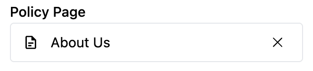
ProductList
Multi-select picker for choosing several products from the store catalog.
When accessing the setting, the value is an Illuminate\Support\Collection of Webkul\Product\Models\Product instances, in the order chosen by the merchant. Products that no longer exist are skipped.
use BagistoPlus\Visual\Settings\ProductList;

public static function settings(): array
{
    return [
        ProductList::make('featured_products', 'Featured Products'),
    ];
}
In Blade:
@foreach ($section->settings->featured_products as $product)
    @visualBlock('@vendor/product-card', 'static-product-card', ['product' => $product])
@endforeach
CategoryList
Multi-select picker for choosing several categories from the store catalog.
When accessing the setting, the value is an Illuminate\Support\Collection of Webkul\Category\Models\Category instances, in the order chosen by the merchant. Categories that no longer exist are skipped.
use BagistoPlus\Visual\Settings\CategoryList;

public static function settings(): array
{
    return [
        CategoryList::make('promoted_categories', 'Promoted Categories'),
    ];
}
In Blade:
@foreach ($section->settings->promoted_categories as $category)
    @visualBlock('@vendor/category-card', 'static-category-card', ['product' => $product])
@endforeach
CmsPageList
Multi-select picker for choosing several CMS pages from the store.
When accessing the setting, the value is an Illuminate\Support\Collection of Webkul\CMS\Models\CmsPage instances, in the order chosen by the merchant. Pages that no longer exist are skipped.
use BagistoPlus\Visual\Settings\CmsPageList;

public static function settings(): array
{
    return [
        CmsPageList::make('footer_pages', 'Footer Pages'),
    ];
}
In Blade:
@foreach ($section->settings->footer_pages as $page)
    <a href="{{ route('shop.cms.page', $page->url_key) }}">
        {{ $page->page_title }}
    </a>
@endforeach
RichText
WYSIWYG rich-text editor input. Useful for inserting formatted content like paragraphs, lists, links, and formatted text.
RichText fields support the following basic formatting options:
- Bold
- Italic
- Underline
- Paragraph
- Headings
- Bullet list
- Ordered list
In addition to the standard attributes, RichText type settings have the following attribute:
| Attribute | Description | Required |
|---|---|---|
inline | Whether the editor should be rendered inline. | No |
use BagistoPlus\Visual\Settings\RichText;

public static function settings(): array
{
    return [
        RichText::make('content', 'Content Block'),

        RichText::make('highlight', 'Highlight Text')
            ->inline(),
    ];
}
In Blade:
@if ($section->settings->content)
    <div class="richtext">
        {!! $section->settings->content !!}
    </div>
@endif

@if ($section->settings->highlight)
    <span class="highlight">
        {!! $section->settings->highlight !!}
    </span>
@endif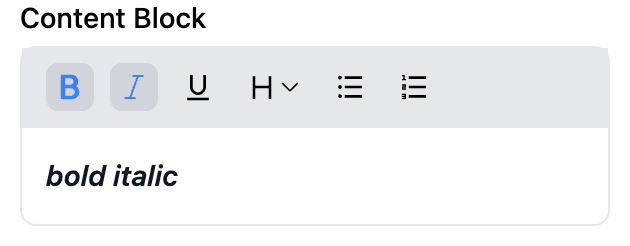
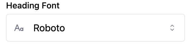
Font
Font picker input. Useful for allowing merchants to select fonts from the Bunny Fonts catalog.
Font settings allow the merchant to select a web-safe font that is automatically loaded from Bunny Fonts.
use BagistoPlus\Visual\Settings\Font;

public static function settings(): array
{
    return [
        Font::make('heading_font', 'Heading Font')->default('roboto'),
    ];
}
In Blade:
@if ($section->settings->heading_font)
    <h1 style="font-family: '{{ $section->settings->heading_font }}', sans-serif;">
        <!-- Content with dynamic font -->
    </h1>
@endif
This will render as:
<h1 style="font-family: 'Roboto', sans-serif;">
  <!-- Content with dynamic font -->
</h1>
Additionally, you may use the following snippet to render any resources necessary to load the font
@pushOnce('styles')
  {{ $section->settings->heading_font->toHtml() }}
@endPushOnce
Will render:
<link rel="preconnect" href="https://fonts.bunny.net" />
<link href="https://fonts.bunny.net/css?family=roboto:" rel="stylesheet" />
Icon
Icon selection input. Useful for allowing merchants to choose an icon from the installed Blade Icon sets.
Bagisto Visual ships with the Lucide icon set pre-installed by default. Developers can manually install and configure additional Blade Icons (like Heroicons, Tabler Icons, etc.) if needed.
use BagistoPlus\Visual\Settings\Icon;

public static function settings(): array
{
    return [
        Icon::make('button_icon', 'Button Icon'),
    ];
}
In Blade:
@if ($section->settings->button_icon)
    <!-- Using @svg Blade directive -->
    @svg($section->settings->button_icon, ['class' => 'w-6 h-6'])

    <!-- Alternatively, manual rendering -->
    {!! $section->settings->button_icon->render(['class' => 'w-6 h-6']) !!}
@endif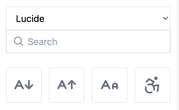
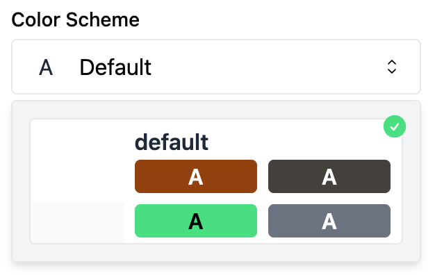
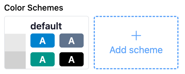
ColorScheme
The ColorScheme setting allows merchants to choose a color scheme defined by the theme. Each color scheme is a named palette of colors (e.g., background, text, primary, etc.) and is defined in the theme using a ColorSchemeGroup.
This setting is typically used in section settings to let the merchant apply predefined styles to specific areas of the storefront.
This setting does not define color schemes — it only lets the merchant pick one from those defined in the theme.
use BagistoPlus\Visual\Settings\ColorScheme;

public static function settings(): array
{
    return [
        ColorScheme::make('color_scheme', 'Color Scheme')
            ->default('default'),
    ];
}
This creates a dropdown in the visual editor populated with all color schemes defined by the theme’s ColorSchemeGroup.
In Blade:
The recommended way to use the selected color scheme in your view is:
<div {!! $section->settings->color_scheme->attributes() !!}>
    <!-- Section content -->
</div>
This will output:
<div data-color-scheme="light">
  <!-- ... -->
</div>
This is used to scope the color schemes tokens to this block.
ColorSchemeGroup
The ColorSchemeGroup setting type allows theme developers to define a set of named color schemes that merchants can reuse across multiple sections. Each color scheme is a collection of color roles (like background, text, primary, etc.) and can be selected using a ColorScheme setting within any section.
This is typically defined once in your theme’s config/settings.php and is editable by the merchant.
- Acts as the central registry of available color schemes
- Enables consistency in color use across sections
- Can be extended or modified by the merchant in the theme editor
Usage in config/settings.php
use BagistoPlus\Visual\Settings\ColorSchemeGroup;

return [
    ColorSchemeGroup::make('color_schemes', 'Color Schemes')
        ->schemes([
            'light' => [
                'label' => 'Light',
                'tokens' => [
                    'background' => '#ffffff',
                    'on-background' => '#111827',
                    'primary' => '#4f46e5',
                    '...'
                ],
            ],
            'dark' => [
                'label' => 'Dark',
                'tokens' => [
                    'background' => '#111827',
                    'on-background' => '#f9fafb',
                    'primary' => '#6366f1',
                    '...'
                ],
            ],
        ]),
];
Scheme Format
Each scheme is an array with:
- A unique key (e.g.,
light,dark,brand) - A label (used in the dropdown)
- A
tokensarray with color roles (e.g.,background,on-background,primary, etc.)
[
    'light' => [
        'label' => 'Light',
        'tokens' => [
            'background' => '#ffffff',
            'on-background' => '#111827',
            'primary' => '#4f46e5',
        ]
    ]
]
Behavior in the Theme Editor
- Merchants can add, edit, or remove color schemes directly from the theme editor
- They can:
- Rename schemes
- Change color values
- Any section using a
ColorSchemesetting will automatically reflect the updated list
Blade Usage
The ColorSchemeGroup setting is not accessed directly in sections. However, theme developers must output CSS variables for every scheme so that sections using ColorScheme can style themselves accordingly.
Each scheme should be scoped using a data-color-scheme attribute:
<style>
  [data-color-scheme='light'] {
    --color-background: #ffffff;
    --color-on-background-text: #111827;
    --color-primary: #4f46e5;
  }
</style>
💡 Suggestion: Include Brand Color Shades
For primary or accent colors, it’s recommended to output shades (like Tailwind’s colors).
<style>
[data-color-scheme="light"] {
    --color-background: #ffffff;
    --color-on-background: #111827;
    --color-primary: #4f46e5;
    --color-primary-50: ...;
    --color-primary-100: ...;
    ...
    --color-primary-950: ...;
}
</style>
These can be used in components via var(--color-primary-500) for consistent, scalable design.
If you are using tailwindcss, you could just use utility classes:
<section class="bg-background text-on-background">
  <button class="px-3 py-2 bg-primary text-on-primary hover:bg-primary-600 active:bg-promary-700">
    Primary button
  </button>
</section>
Bagisto Visual provides a helper method to generate the full CSS output automatically from the theme's color schemes:
{{-- layouts/default.blade.php --}}
<style>
  @foreach ($theme->settings->color_schemes as $scheme)
    [data-color-scheme="{{ $scheme->id }}"] {
      {!! $scheme->outputCssVars() !!}
    }
  @endforeach
</style>- This will loop over every scheme
- Output all defined colors as
--color-*tokens - Automatically generate shades for brand color roles
Notes
- Only one
ColorSchemeGroupshould be defined per theme - Sections do not define color schemes — they reference them via the
ColorSchemesetting - If no
ColorSchemeGroupis defined,ColorSchemefields will not be functional
-> Read more about color schemes
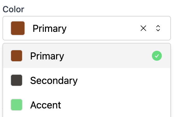
ColorToken
Semantic color token picker. Useful when a section or block should reference a role inside the active color scheme (such as primary, danger, or success) instead of a hardcoded literal color.
A ColorToken value stays a token string at every layer of the stack. At render time it resolves to a CSS variable like var(--color-primary), so the same value automatically adapts to the active data-color-scheme on the page.
How it differs from the other color related setting types:
- Color stores a literal color value (hex, rgba, etc.).
- ColorScheme lets the merchant pick a whole scheme to apply to a section.
ColorTokenlets the merchant pick one role inside whatever scheme is currently active.
use BagistoPlus\Visual\Settings\ColorToken;

public static function settings(): array
{
    return [
        ColorToken::make('button_color', 'Button color')
            ->default('primary'),
    ];
}
In Blade, call cssVar() on the resolved value to emit the CSS variable reference:
@if ($section->settings->button_color)
    <a style="background-color: {{ $section->settings->button_color->cssVar() }}">
        Buy now
    </a>
@endif
Casting the value to string returns the token itself (for example primary), which is useful when you want to drive class names or data attributes from the token:
<button class="btn btn-{{ $section->settings->button_color }}">
    Add to cart
</button>
In the editor, each token swatch is rendered using the colors from the nearest active color scheme.
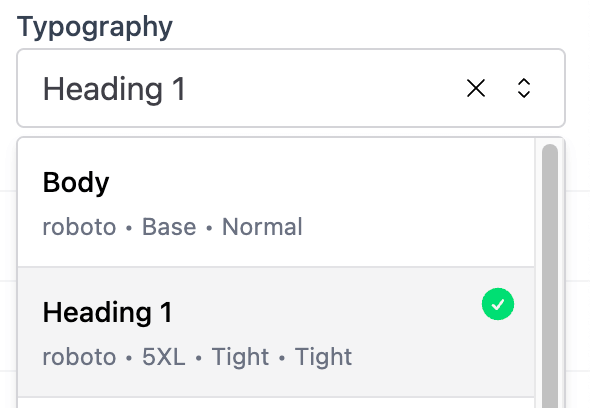
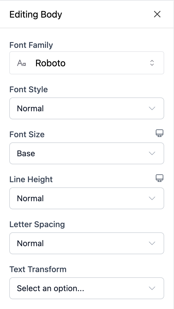
Typography
The Typography setting allows merchants to select a typography preset for text styling. Typography presets are defined once in the theme's settings using TypographyPresets, and sections or blocks can reference them using this setting.
use BagistoPlus\Visual\Settings\Typography;

public static function settings(): array
{
    return [
        Typography::make('heading_typography', 'Heading Typography'),
        Typography::make('body_typography', 'Body Typography'),
    ];
}
This creates a dropdown in the visual editor populated with all typography presets defined by the theme.
In Blade:
Apply the selected typography using the attributes() method:
<h1 {{ $section->settings->heading_typography->attributes() }}>
    Welcome to our store
</h1>
This outputs:
<h1 data-typography="heading">Welcome to our store</h1>The data-typography attribute scopes typography CSS variables to this element.
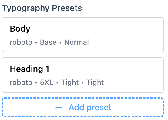
TypographyPresets
The TypographyPresets setting type allows theme developers to define a set of named typography presets that merchants can reuse across multiple sections. Each typography preset is a collection of font properties (fontFamily, fontSize, lineHeight, etc.) that can be selected using a Typography setting.
This is typically defined once in your theme's config/settings.php and is editable by the merchant.
- Acts as the central registry of available typography presets
- Enables consistency in text styling across sections
- Supports responsive typography for fontSize and lineHeight
- Merchants can add, edit, or remove presets in the theme editor
Usage in config/settings.php
use BagistoPlus\Visual\Settings\TypographyPresets;

return [
    TypographyPresets::make('typography_presets', 'Typography Presets')
        ->presets([
            'heading' => [
                'fontFamily' => 'Inter',
                'fontWeight' => '700',
                'fontSize' => '2xl',
                'lineHeight' => 'tight',
                'fontStyle' => 'normal',
                'letterSpacing' => 'normal',
                'textTransform' => 'none',
            ],
            'body' => [
                'fontFamily' => 'Inter',
                'fontWeight' => '400',
                'fontSize' => 'base',
                'lineHeight' => 'normal',
                'fontStyle' => 'normal',
                'letterSpacing' => 'normal',
                'textTransform' => 'none',
            ]
        ]),
];
Generating CSS
After defining typography presets, you must generate the CSS in your theme's layout file. This makes the typography styles available to all sections using the Typography setting.
Basic Usage:
{{-- layouts/default.blade.php --}}
<style>
  @foreach ($theme->settings->typography_presets as $typography)
    {!! $typography->toCss() !!}
  @endforeach
</style>

{{-- Load fonts from Bunny Fonts --}}
@pushOnce('styles')
  @foreach ($theme->settings->typography_presets as $typography)
    {!! $typography->toHtml() !!}
  @endforeach
@endPushOnce
This generates CSS for typography styles:
[data-typography='heading'] {
  --typography-font-family: 'Inter', sans-serif;
  --typography-font-style: normal;
  --typography-font-weight: 700;
  --typography-font-size: 1.5rem;
  --typography-line-height: 1.25;
  --typography-letter-spacing: 0em;
  --typography-text-transform: none;
}

[data-typography='body'] {
  --typography-font-family: 'Inter', sans-serif;
  --typography-font-style: normal;
  --typography-font-weight: 400;
  --typography-font-size: 1rem;
  --typography-line-height: 1.5;
  --typography-letter-spacing: 0em;
  --typography-text-transform: none;
}
Render the font links for all typography presets once in your layout:
{{ $theme->settings->typography_presets->fontLinks() }}This generates HTML to load the configured font families from Bunny Fonts. When the same font is used across multiple presets, all configured weights and styles are grouped into one request:
<link rel="preconnect" href="https://fonts.bunny.net" crossorigin />
<link href="https://fonts.bunny.net/css?family=inter:700,400" rel="preload" as="style" />
<link href="https://fonts.bunny.net/css?family=inter:700,400" rel="stylesheet" />
With Custom Selectors:
You can also apply typography directly to HTML elements by passing a custom selector:
<style>
  {!! $theme->settings->typography_presets['heading']->toCss('h1, h2, h3') !!}
  {!! $theme->settings->typography_presets['body']->toCss('p, li, td') !!}
</style>
This generates CSS that applies to both the data-typography attribute AND the custom selector:
[data-typography='heading'],
h1,
h2,
h3 {
  --typography-font-family: 'Inter', sans-serif;
  --typography-font-style: normal;
  --typography-font-weight: 700;
  --typography-font-size: 1.5rem;
  --typography-line-height: 1.25;
  --typography-letter-spacing: 0em;
  --typography-text-transform: none;
}

[data-typography='body'],
p,
li,
td {
  --typography-font-family: 'Inter', sans-serif;
  --typography-font-style: normal;
  --typography-font-weight: 400;
  --typography-font-size: 1rem;
  --typography-line-height: 1.5;
  --typography-letter-spacing: 0em;
  --typography-text-transform: none;
}
Applying CSS Variables:
In your theme's CSS, apply the generated CSS variables to elements:
[data-typography] {
  font-family: var(--typography-font-family);
  font-style: var(--typography-font-style);
  font-weight: var(--typography-font-weight);
  font-size: var(--typography-font-size);
  line-height: var(--typography-line-height);
  letter-spacing: var(--typography-letter-spacing);
  text-transform: var(--typography-text-transform);
}
Preset Format
Each preset is an array with the following properties:
| Property | Type | Description | Required | Values |
|---|---|---|---|---|
fontFamily | string|null | Font family name | No | Any font family name |
fontWeight | string | Font weight | Yes | 100, 200, 300, 400, 500, 600, 700, 800, 900 |
fontSize | string|array | Font size token or responsive config | Yes | xs, sm, base, lg, xl, 2xl, 3xl, 4xl, 5xl, 6xl, 7xl, 8xl, 9xl |
lineHeight | string|array | Line height token or responsive config | Yes | none, tight, snug, normal, relaxed, loose |
fontStyle | string | Font style | Yes | normal, italic |
letterSpacing | string | Letter spacing token | Yes | tighter, tight, normal, wide, wider, widest |
textTransform | string | Text transform | Yes | none, uppercase, lowercase, capitalize |
Font Size Tokens:
| Token | CSS Value | Description |
|---|---|---|
xs | 0.75rem | Extra small (12px) |
sm | 0.875rem | Small (14px) |
base | 1rem | Base size (16px) |
lg | 1.125rem | Large (18px) |
xl | 1.25rem | Extra large (20px) |
2xl | 1.5rem | 2x large (24px) |
3xl | 1.875rem | 3x large (30px) |
4xl | 2.25rem | 4x large (36px) |
5xl | 3rem | 5x large (48px) |
6xl | 3.75rem | 6x large (60px) |
7xl | 4.5rem | 7x large (72px) |
8xl | 6rem | 8x large (96px) |
9xl | 8rem | 9x large (128px) |
Line Height Tokens:
| Token | CSS Value |
|---|---|
none | 1 |
tight | 1.25 |
snug | 1.375 |
normal | 1.5 |
relaxed | 1.625 |
loose | 2 |
Letter Spacing Tokens:
| Token | CSS Value |
|---|---|
tighter | -0.05em |
tight | -0.025em |
normal | 0em |
wide | 0.025em |
wider | 0.05em |
widest | 0.1em |
Responsive Typography
Typography supports responsive configurations for fontSize and lineHeight using an array format with breakpoint keys:
TypographyPresets::make('typography_presets', 'Typography Presets')
    ->presets([
        'responsive-heading' => [
            'fontFamily' => 'Inter',
            'fontWeight' => '700',
            'fontSize' => [
                '_default' => '2xl',  // Default size
                'mobile' => 'xl',     // max-width: 639px
                'tablet' => '2xl',    // 640px - 1023px
                'desktop' => '3xl',   // min-width: 1024px
            ],
            'lineHeight' => [
                '_default' => 'tight',
                'mobile' => 'snug',
                'desktop' => 'tight',
            ],
            'fontStyle' => 'normal',
            'letterSpacing' => 'normal',
            'textTransform' => 'none',
        ],
    ]);
Breakpoints:
| Breakpoint | Media Query | Description |
|---|---|---|
_default | (none) | Default value |
mobile | max-width: 639px | Mobile devices |
tablet | min-width: 640px and max-width: 1023px | Tablet devices |
desktop | min-width: 1024px | Desktop devices |
Generated responsive CSS:
[data-typography='responsive-heading'] {
  --typography-font-size: 1.5rem;
  --typography-line-height: 1.25;
}

@media (max-width: 639px) {
  [data-typography='responsive-heading'] {
    --typography-font-size: 1.25rem;
    --typography-line-height: 1.375;
  }
}

@media (min-width: 1024px) {
  [data-typography='responsive-heading'] {
    --typography-font-size: 1.875rem;
    --typography-line-height: 1.25;
  }
}
Behavior in the Theme Editor
- Merchants can add, edit, or remove typography presets
- Custom presets are assigned IDs like
typography-1,typography-2, etc. - Theme-defined presets cannot be deleted (only custom ones can be removed)
- Changes are immediately reflected in sections using the
Typographysetting
Notes
- Only one
TypographyPresetssetting should be defined per theme - Sections reference presets via the
Typographysetting, not directly - If no
TypographyPresetsis defined,Typographyfields will not be functional - Load preset font families from Bunny Fonts with
$theme->settings->typography_presets->fontLinks() - Bunny Fonts is the only supported font provider. See the Font setting type for more details on font loading
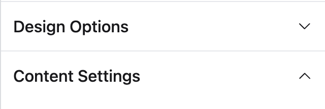
Header
Visual divider or label inside settings groups. Useful for organizing complex settings panels into meaningful sections.
Unlike other settings, the Header type:
- Does not require an
id - Only needs a label (text that will be displayed as a title)
- Does not produce any setting data (not available inside Blade)
use BagistoPlus\Visual\Settings\Header;
use BagistoPlus\Visual\Settings\Color;
use BagistoPlus\Visual\Settings\Text;

public static function settings(): array
{
    return [
        Header::make('Design Options'),

        Color::make('background_color', 'Background Color')
            ->default('#ffffff'),

        Color::make('text_color', 'Text Color')
            ->default('#000000'),

        Header::make('Content Settings'),

        Text::make('heading', 'Heading Text')
            ->default('Welcome to our store'),

        Text::make('subheading', 'Subheading Text')
            ->default('Discover amazing products'),
    ];
}
Note: Header settings are only used inside the theme editor to visually group fields. They are not available inside Blade templates.